Mechanical Usability

Saturday, August 02, 2008

Blog Move!

I used to think that I would have a separate blog for each of my separate interests. It turns out that was unrealistic, so now I have one uniblog called Everything's Dynamic. I've exported all of the posts from Mechanical Usability over there, but the comments did not survive the move. Nevertheless, they are still on Mechanical Usability ad infinitum, and the posts with comments contain links back to the original post.

Friday, December 01, 2006

Design For Not Needing To Be Fixed

I finally fixed the door knob for the door going between the garage and my house (for the last couple of months I had just taped the latching mechanism opened so that I wouldn't have to deal with it), and I discovered that the door knob has a really obvious design flaw. But first some background.

Background
A couple of months ago, I attempted to open the door going to the garage from inside the house. To my surprise, the knob turned, but the door didn't open. I kept turning the knob, and nothing happened...I quickly deduced that the knob wasn't mechanically coupled to the latching mechanism, so turning the knob would do no good. Since the only other way into the garage was through the garage door openers inside the cars that were parked inside the garage, the only way I could get into the garage would be to somehow open the door. Luckily, after a couple of attempts, I was able to pry the latch open by wedging a butter knife in-between the latch and the slot in the door frame into which the latch moves, and I got the door open. Since I was in a hurry, I simply put a piece of tape over the latch to prevent it from going back into the slot when the door closed.

Later, when I removed the entire door knob assembly, I figured out that the way the knob was coupled to the latch was with a simple square (square in cross-section) bar. As the diagram below shows, the Square Slot (in which the Square Bar resides) in the Internal Door Knob has an extra little feature that the Square Bar press-fits into. The square bar travels through the Door, through the Latching Mechanism, and into the External Door Knob. Turn either knob, and the square bar to which the knob is rigidly fixed turns the latching mechanism and just like that, the door unlatches.

Figure 1 - How it's supposed to work

After looking at all the parts of the door knob assembly, I realized that to fix it, I'd simply have to re-rigidly-fix the square bar to one of the door knobs. This was easy enough, and in just a couple of minutes the door knob was back on the door, fully functional.
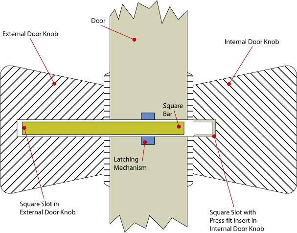
The design flaw
So what's the big deal? Well, this whole charade could easily have been avoided if the door knob were better designed. The following diagram shows what the door knob system looked like when it was broken.

Figure 2 - How it broke

As stated above, the problem is that the Square Bar had become de-coupled from the Press-fit Insert in the Square Slot in the Internal Door Knob. But what really made matters worse is the fact that the Square Bar was too short! As the above diagram shows, since the Square Bar was so short, once it became detached from the Press-fit Insert it was able to float freely, and eventually it moved such that turning the Internal Door Knob would no longer actuate the Square Bar. Plus, the fact that the only way the Square Bar can be coupled to the Internal Door Knob end of the Square Slot is via a press-fit, there's no way the Square Bar, once loose, would ever incidentally fall back into the Internal Door Knob.

The solution
The solution to all of this madness would simply be to make the Square Bar longer. In fact, it should be almost as long as the entire Square Slot. This would alleviate the need for the extra Press-fit Insert, plus there would be no way for the Square Bar to become decoupled from either the Internal or External Door Knobs. The following diagram shows the proposed solution.


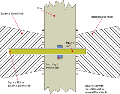
Figure 3 - How to really solve the problem

Simple is better.

Saturday, August 12, 2006

The usability of buttons

There's a new bad design up at baddesigns.com. In this case, Mike criticizes the use of poor icons on buttons used to control something (I still can't figure it out) in a car.

Indeed, the icons are useless. But I think another criticism of the buttons could be made. Any buttons placed within reach of the driver should require minimal visual attention, as the driver should be paying maximum attention to the task of driving (a task that is of course, highly visual). So not only should the buttons not be marked with confusing icons, they also shouldn't all be shaped and/or textured the same way.

The shape/texture of the buttons needn't necessarily map to their function, as the seat adjustment control in a Mercedes-Benz (pictured to the right) does; simply making them easily distinguishable to the touch and laying them out in a reasonable (perhaps naturally-mapped) configuration would do the trick. It's easy to remember that the square button does this, the circular button, does that, etc. Far easier, then remembering that the top-middle button, which feels like all the other buttons, does something.

Sources of images: Button image from here. Seat-adjustment image from Norman, The Design of Everyday Things (2002)

Wednesday, April 12, 2006

Is this product usable or not?

The USB drive in the image to the left literally inflates as it fills up with data. At first glance, this seems like a very intuitive way to give feedback to the user. It fits with our cultural sensitivities (when things get full they get bigger--think water balloons, basketballs, even our own stomachs) and doesn't rely on text or icons. That which is conveyed through the interface is obvious.

Yet, I can't help but think that while this device might be psychologically usable, it probably isn't very ergonomically useful. That is, it does a good job of cleverly conveying information, but the fact that its size increases might make it uncomfortable to carry. My pockets are already too full with a simple key chain and a regular USB drive (well, I actually have 2 USB drives)--I'm not sure I want to carry something around that, as the day progresses, will get bulkier.

What's more, while I applaud the design for the slickness with which it informs the user through a channel not currently exploited, I don't think the information represented by its changing size is all that useful. Unless I have to pick out a USB drive from a pile of five or six similar devices, I don't really need to know how full the drive is. And, once I plug it into a computer, which I'll inevitably do, I'll know just how full it is then. I guess one situation where the inflated state might come in handy is if I'm in a rush in the morning and know that sometime later that day, I'll need to put stuff on my USB drive. If I pick up the drive and see/feel that it's fairly full, I'll know I have to take a couple of minutes and empty the current contents of the drive on my computer.

But still, after I fill the drive up with data, it's going to be big and bulky.

I think a more effective (although admittedly less playful) design would be to add a decibel-like meter, a la the wrist meter used by Tom Cruise in Mission Impossible, sort of like the image to the right.

Or even cooler, an classic analog needle shrunk down to the size of a USB drive.


I heard about this device here. The images are from here: image 1, image 2, and image 3.

Friday, September 23, 2005

The expanding world of interfaces

USB, WiFi, Webcams...these technologies are all making increasingly creative interfaces possible. On the output side of things, here is a toy rabbit that uses WiFi to wiggle its ears when you have email. For input, here's a demonstration of using play-doh to control the playback speed of a video.

This reminds me of Durrell Bishop's marble answering machine (Ctrl+F and search for "marble") , in which marbles (real, physical marbles) are used to inform the user how many messages they have and to, by dropping the marbles into a hole, playback the messages.

This trend of using physical, tangible interfaces to control non-physical events (email, video, voice messages) is really exciting, especially for those who don't want to let computer programmers and graphic designers have all the fun.

Wednesday, September 21, 2005

Usability sells?

Nintendo thinks they'll be able to market the usability of their new video controller to help sell their next-generation video console.
"We thought about how everyone in the family uses the TV remote, but some people don't want to even touch the game controller," Nintendo President Satoru Iwata said. "We want to set a new interface standard for games."
Neat.

Saturday, July 09, 2005

Neat site

Here's a neat site:

This is broken

They talk about, among other things, product design.

Update: Ironically, the above link is broken, so use this one instead.